In a healthcare landscape driven by outcomes and value, Power BI offers provider organizations a powerful yet accessible way to transform raw data into actionable insights. This article explores how hospitals can leverage Power BI to reduce readmissions, monitor care quality, identify high-risk patients, optimize resource use, and manage chronic conditions more effectively. Through a detailed, hypothetical case study of Aurora General Hospital, it illustrates how healthcare executives can guide their teams toward better decisions and measurable improvements in patient care. From strategic planning to implementation tips, this guide equips leaders with the knowledge to initiate data-driven transformation—improving patient outcomes while enhancing operational efficiency.
Healthcare is undergoing a data-driven transformation. Hospitals today collect an avalanche of information – a typical hospital generates about 50 petabytes of data per year, including everything from clinical notes and lab results to medical images and sensor readings. Yet an estimated 97% of that data goes unused in decision-making. This represents a massive untapped opportunity to improve patient care. At the same time, the industry is shifting toward value-based care models, where providers are reimbursed for quality and outcomes rather than volume of services. Regulators and payers now scrutinize metrics like readmission rates, preventive screening adherence, and patient satisfaction as key indicators of care quality. In this landscape, healthcare executives are increasingly recognizing that analytics can bridge the gap between data overload and meaningful action. By leveraging powerful yet accessible tools like Microsoft Power BI, hospitals can transform raw data into actionable insights – ultimately improving patient outcomes, streamlining operations, and meeting strategic goals in quality and value.
The Power of Data in Patient Care
Modern hospitals capture a 360-degree view of each patient through data. Electronic health records (EHRs) log diagnoses, medications, vital signs, and clinician notes. Laboratories produce numeric results for thousands of tests. Imaging systems store X-rays, MRIs, and ultrasounds. There’s operational data on bed occupancy, surgery schedules, staffing levels, and supply usage. Financial and claims data track billing and costs. Even patient feedback via surveys and data from wearable devices or remote monitors contribute to the growing dataset. When these diverse data sources are consolidated and analyzed, the insights can transform patient care. For example, by examining patterns in EHR and outcomes data, providers might discover early warning signs of complications – enabling interventions before a patient’s condition worsens. Analytics can reveal gaps in care (such as patients overdue for follow-ups or preventive screenings) so that healthcare teams can proactively reach out, rather than waiting for readmissions or emergencies. In short, data empowers a shift from reactive medicine to proactive, personalized care. Instead of relying on anecdotal experience, clinicians and executives can make evidence-based decisions grounded in real-world patient trends. The result is often faster diagnoses, more effective treatments, and fewer adverse events. In the high-stakes environment of healthcare, harnessing data means better outcomes for patients and more efficient use of resources.
Looking to improve patient outcomes with data?
Discover how Power BI can help your healthcare organization turn data into actionable insights—reducing readmissions, improving care quality, and optimizing resources with real-time dashboards tailored to your hospital’s needs.
Let us show you how to build a data-driven future for better care delivery.

Let us show you how to build a data-driven future for better care delivery.
Why Power BI?
Faced with an ocean of data, hospitals need a user-friendly platform to aggregate, visualize, and share insights. This is where Microsoft Power BI shines. Power BI is a modern analytics and business intelligence tool that fits well into hospital IT ecosystems. First, it easily connects to myriad healthcare systems – from EHR databases to billing platforms and even medical device feeds – pulling data into one unified view. This breaks down the silos between departments. For instance, rather than laboratory, pharmacy, and radiology each living in separate reports, Power BI dashboards can bring all these data together on one screen. As the consulting firm Multishoring notes, “When a doctor reviews a case, they see everything – emergency visits, lab results, medications, and radiology findings – in one place.” Such unified patient views reduce duplication (one hospital cut redundant tests by up to 30% by sharing data across departments and ensure everyone is acting on the same information.
Secondly, Power BI’s rich interactive dashboards make complex data easier to grasp. Executives and clinicians can filter data on the fly, drill into details, or view high-level trends without needing a background in analytics. Instead of poring over dozens of static spreadsheets, staff see intuitive charts and graphs that highlight patterns and outliers instantly. This speed of understanding cuts down decision time from hours to minutes – a nurse manager might spot an uptick in infection rates this week and immediately initiate a check on sanitation protocols, or an administrator might notice today’s ER wait time creeping up and call in an extra triage nurse. Power BI also supports real-time data updates from source systems, so dashboards refresh with the latest information. Leaders no longer have to wait for month-end reports; they can monitor metrics as they evolve and respond faster.
From a business perspective, Power BI aligns with hospital needs for security and scalability. It offers robust access controls and governance features to protect sensitive patient information – crucial for HIPAA compliance. Data can be restricted by user role, ensuring clinicians only see appropriate patient data, and all data transfers can be encrypted. Moreover, Power BI integrates with other Microsoft tools common in healthcare (such as Azure cloud services, Microsoft 365, or Teams), which means it can slot into existing IT infrastructure with relative ease. Reports can even be embedded into the applications staff already use daily (for example, a clinician portal or intranet), making data accessible within workflows.
Finally, the business case for Power BI often comes down to empowering staff at all levels to engage with data. Its drag-and-drop interface and extensive online support community lower the barrier to entry for non-technical users. Many hospital departments have “power users” or analysts who, with some training, can develop their own reports and dashboards, reducing burden on IT teams. In short, Power BI combines the technical capabilities needed to handle healthcare’s complex data with a simplicity and flexibility that encourages a data-driven culture. It turns raw data into visual, shareable stories about performance – stories that can drive strategic improvements in patient outcomes and operational efficiency.
Key Use Cases for Improving Outcomes
Analytics is not abstract in healthcare – it directly ties to practical initiatives that improve care. Here are some high-impact use cases where Power BI dashboards can help healthcare organizations achieve better patient outcomes and performance:
Reducing Readmissions
Unplanned hospital readmissions (patients returning within 30 days of discharge) are a costly and quality-of-care concern. High readmission rates often signal issues in the care continuum, such as inadequate discharge planning or poor follow-up. Through analytics, hospitals can attack this problem on multiple fronts. Power BI can aggregate data on discharges and subsequent admissions to identify patterns – for example, pinpointing that heart failure patients from a certain unit are readmitted at higher rates, or that readmissions spike when specific discharge protocols aren’t followed. More powerfully, predictive models can be integrated so that a dashboard flags high-risk patients before they leave the hospital. A care manager might see a daily Power BI report listing patients with a readmission risk score (based on age, diagnosis, comorbidities, social factors, etc.), and then arrange follow-up calls, home care visits, or other interventions for those at highest risk. This targeted approach prevents many return visits by addressing issues early (such as clarifying medication instructions or ensuring prompt outpatient appointments).
Hospitals that harness data in this way have documented tangible improvements. For example, Rush University Medical Center used advanced analytics and real-time data to tailor post-discharge care, resulting in 27 fewer readmissions and an estimated $694,000 in savings over a certain period. Their initiative combined internal clinical data with benchmarking against peers, which helped teams zero in on what wasn’t working and implement fixes. A Power BI dashboard for readmissions might show overall 30-day readmission rates and drill down by department, physician, or diagnosis, highlighting outliers in red. Upon seeing a problem area (say, pneumonia patients on one ward), leadership can convene a review of those cases to find root causes – maybe patients weren’t getting a follow-up call – and then track in the dashboard whether the corrective action lowers the readmission rate over the next quarter. Reducing readmissions not only improves outcomes (patients stay healthier at home), but also protects the hospital from financial penalties associated with Medicare’s readmission reduction program. It’s a clear win-win, and analytics provides the compass to navigate there.
Monitoring Care Quality Metrics
Healthcare executives live by their dashboard of quality metrics. Instead of sifting through lengthy reports, a well-designed Power BI dashboard can provide an at-a-glance view of core quality and patient safety indicators. These might include infection rates (such as surgical site infections or central-line-associated bloodstream infections), patient fall rates, medication error rates, mortality and complication indices, and patient satisfaction scores. Monitoring these metrics in near real time is crucial – waiting months to discover a trend in quarterly data could mean lives impacted or accreditation goals missed. With an analytics solution, quality leaders can set thresholds and alerts on each indicator. If the infection rate in the ICU creeps above target, the dashboard can flag it, prompting immediate investigation: Was there a lapse in sterilization procedures? Do certain shifts need retraining? By catching the signal early, the team can respond before a full outbreak or systemic issue occurs.
Common Key Performance Indicators (KPIs) for healthcare quality include patient satisfaction, readmission rates, average length of stay, emergency department wait times, and hospital-acquired infection rates. Each of these metrics offers insight into how well the organization is delivering care. For instance, patient satisfaction (often measured via surveys like HCAHPS) reflects not only service quality but also aspects of communication and trust – critical components of good outcomes. If a dashboard shows satisfaction scores dipping, management might drill down into specific units or even specific survey questions (e.g., “communication with nurses”) to target improvements. High readmission rates, as discussed, flag transitional care issues. Length of stay is closely watched as well: an excessively long stay could indicate inefficiencies or complications, whereas too short a stay might risk patients leaving unready. By visualizing length of stay alongside outcomes, hospitals can find the optimal balance for patient recovery. ED wait times affect both patient experience and clinical outcomes (long waits can lead to patients leaving without treatment or conditions worsening). Tracking this in real time allows for swift operational fixes – for example, reallocating staff on the fly if waits exceed a certain threshold. Infection rates (like C. diff or post-surgical infections) directly impact patient safety; a rise in infections would spur an immediate quality improvement project (hand hygiene audits, equipment sterilization checks, etc.).
In practice, a Power BI quality dashboard might have a section for each domain (safety, effectiveness, patient experience, etc.) with gauges or trend lines against targets. The visual nature of the dashboard focuses leadership discussions: rather than wading through pages of numbers, a team can see “green, yellow, red” indicators and zero in on the reds. This kind of monitoring promotes accountability as well – department heads know their metrics are transparent, which often motivates sustained improvement efforts. Over time, continuous monitoring and small course corrections keep the hospital on track toward its overall outcome goals (for example, zero preventable harms, top-quartile patient satisfaction, and so on). In summary, real-time quality metric dashboards act as an early warning system and a performance scorecard, ensuring that quality of care remains high and continuously improving.
Identifying High-Risk Patients
Within any hospital or health system, a subset of patients will inevitably consume a disproportionate share of care or be at higher risk for poor outcomes. These might be patients with multiple chronic conditions, frequent emergency visits (so-called “frequent flyers”), or those at risk for complications like sepsis or falls. Data analytics helps shine a light on who these patients are and enables proactive management. One approach is using risk stratification algorithms applied to clinical and demographic data to produce risk scores – for events like risk of readmission, risk of deterioration, or risk of high cost. Power BI can be used to surface these risk scores in a meaningful way. For example, a care management dashboard could list in real time the top 10% highest-risk inpatients, or a clinic dashboard could flag chronic disease patients who haven’t had key health checks and thus are at rising risk of an acute episode.
A striking real-world example comes from the U.S. Veterans Health Administration, which built a comprehensive data warehouse of veteran health records and layered Power BI dashboards on top. Clinicians there were able to use a condition-focused dashboard to sift through millions of records and narrow down to a cohort of about 40 patients who met specific high-risk criteria for chronic diseases. In other words, with just a few clicks, providers could go from an overwhelming patient population to an actionable “watch list” of individuals needing attention. This is transformational – it’s like finding the needle in the haystack before it causes harm. Instead of waiting for those high-risk patients to cycle in and out of the hospital, care teams can reach out while there’s still time to adjust medications, schedule preventive care, or provide education that keeps the patient stable.
Identifying high-risk patients is especially important in managing chronic disease populations (which we’ll discuss more shortly). For instance, consider a diabetic population: analytics can identify which diabetic patients have rising HbA1c levels or haven’t had an eye exam in two years – indicators that they may suffer complications soon if not intervened. A Power BI dashboard can list these names along with risk factors, and care coordinators can then prioritize them for follow-up calls or clinic appointments. Similarly, in the inpatient setting, a dashboard might incorporate an early warning score (like MEWS or NEWS for sepsis risk) for all patients on the ward; a charge nurse glancing at it can instantly see if any patient’s risk score is trending upward and alert a rapid response team. All these applications pivot on the same idea: using data to spot trouble before it happens. By doing so, hospitals can reduce code blues, ICU transfers, and emergency visits, while patients enjoy better health trajectories. Power BI’s ability to handle large data sets and present custom filters (e.g. “show me all heart failure patients with >2 admissions last 6 months and living alone”) makes it an ideal tool for zeroing in on those patients who need the most attention. In an era of personalized medicine, this kind of risk-focused analytics ensures each patient gets the right level of care for their situation, improving outcomes across the board.
Optimizing Resource Utilization
Delivering great care isn’t just about clinical decisions – it also hinges on operational efficiency. Resource utilization analytics helps hospitals ensure that staff, beds, operating rooms, and equipment are used optimally to meet patient needs without waste. Many healthcare facilities struggle with scenarios like an ICU at capacity while step-down beds lie empty, or operating rooms standing idle on some days and overbooked on others. Traditionally, these mismatches were addressed by intuition or reactive adjustments. Power BI enables a more data-driven approach by analyzing usage patterns over time and making them visible. Administrators can see exactly when and where demand peaks for various resources. For example, a hospital might discover that Mondays consistently have 20% higher emergency department volume and adjust nurse staffing levels accordingly. Or data may show that OR utilization drops off on Friday afternoons, suggesting an opportunity to schedule elective surgeries then to balance the load.
Through interactive dashboards, department leaders get a clear picture of metrics like bed occupancy rate, average OR utilization percentage, imaging machine idle times, clinician workload distribution, and more. These insights help in predicting needs and planning ahead. If historical data (combined perhaps with seasonal illness trends) indicates a surge of patients in winter, a smart dashboard will highlight that so the hospital can preemptively open additional beds or extend clinic hours. Conversely, if certain expensive equipment (say an MRI machine) is underutilized, that might inform decisions to consolidate services or adjust scheduling. One large hospital found that by analyzing staffing patterns, they could realign shifts and reduce overtime costs by 8% while actually improving patient satisfaction, since nurses were more optimally allocated to match patient flow. This underscores how efficiency and quality can go hand in hand when guided by data.
Moreover, resource dashboards can be monitored in real time to make tactical adjustments during the day. Suppose an influx of patients this morning has the med-surg floor 95% full – the operations center can see this on the dashboard and trigger protocols to expedite some discharges or divert new admissions to another wing. If the pharmacy gets backed up with orders, an alert might pop up so extra pharmacists can be assigned to the shift. These kinds of moves, informed by up-to-the-minute data, prevent bottlenecks from snowballing into crises. They also enhance patient outcomes: a well-resourced unit means patients get timelier care (no waiting hours for a bed or a procedure) and staff are not overburdened to the point of error.
From an executive viewpoint, optimizing resource use via analytics improves the bottom line as well. Reducing waste – be it unused OR time or overstocked supplies – translates to cost savings, which can be reinvested in patient care. It also supports better staff morale when workload is balanced fairly. Power BI’s role is to make the complex choreography of hospital operations visible and understandable. With its help, what used to be managed with gut feelings and retrospective reports can now be managed with precision and foresight, ensuring the right resources are in the right place at the right time for patients.
Managing Chronic Disease Populations
Chronic diseases like diabetes, heart failure, COPD, and hypertension account for a huge portion of healthcare utilization and costs. For provider organizations, improving outcomes for chronic disease populations is a top strategic priority – it not only improves lives but also reduces avoidable hospitalizations and aligns with value-based care incentives. Power BI can be a powerful enabler of population health management strategies in this area. By integrating data from primary care, specialists, hospitals, and even community programs, a comprehensive dashboard can be built for each major chronic condition. This dashboard might show population-level metrics: e.g., what percentage of the diabetes population has their blood sugar (HbA1c) under control, or the annual trend in asthma-related ER visits. More importantly, it can drill down to identify gaps in care. Perhaps only 60% of diabetic patients had an eye exam in the last year – the tool can list those who missed it, so care managers can send reminders. Or it may reveal that patients in a certain zip code have higher blood pressure on average, prompting outreach that considers local social determinants of health.
The strength of Power BI here is in handling both aggregate views for planning and patient-specific views for action. A population health team could use a dashboard to monitor how well they are doing on key chronic care management metrics (for example, for a heart failure cohort: medication adherence rate, 30-day post-discharge follow-up rate, average ejection fraction trends, etc.). If one of these indicators is off target, they know where to focus improvement efforts. For instance, if data shows only half of heart failure patients see a cardiologist within a month of hospitalization (and those who don’t have more readmissions), the hospital can implement a better post-discharge referral process and then watch that metric improve on the dashboard. On an individual patient level, clinicians can click through to see a “patient profile” that aggregates everything about a chronic patient: their history of readings (glucose levels, blood pressure over time), medications, last appointments, and any looming care gaps. This comprehensive view supports personalized interventions – maybe a care coordinator notices a diabetic patient’s blood sugar has been rising and they missed their last nutrition counseling session, so she arranges a home visit by a diabetes educator.
Analytics also facilitates segmentation of populations by risk or other factors. For example, chronic disease registries can be layered with socio-economic data to identify patients who might benefit from additional support. A dashboard focusing on social determinants of health (SDoH) could map patients by factors like income, housing stability, or access to transportation, and correlate these with outcomes. This way, leadership can allocate resources (like community health workers or telehealth programs) to the neighborhoods or groups that need it most, improving equity in outcomes. By monitoring chronic disease populations in such a data-driven manner, healthcare organizations aim to prevent complications (e.g., prevent a diabetic foot infection from ever occurring by ensuring regular check-ups), keep patients out of the hospital, and enhance overall quality of life. In fact, studies have shown that using predictive analytics to identify high-risk chronic patients and intervening early leads to a more proactive, preventative approach in care delivery. Over time, success in chronic disease management will be reflected in metrics like lower hospitalization rates for those patients, better control of clinical indicators (blood pressure, glucose, etc.), and higher patient satisfaction because patients feel looked-after and supported. Power BI serves as the nerve center for these efforts – collecting the multitude of data points involved in chronic care and presenting them in a way that teams can continuously learn and improve.
A Hypothetical Example: Aurora General Hospital
To illustrate how all these pieces come together, let’s walk through a fictional scenario. Aurora General Hospital is a mid-sized community hospital that, like many others, faces pressure to improve patient outcomes while controlling costs. The leadership team at Aurora General decides to embark on a data-driven transformation using Power BI as their analytics platform. Here’s how their journey unfolds:
Aurora’s Challenges: Six months ago, Aurora General had a few pain points. Their 30-day readmission rate was creeping above the national benchmark, especially for heart failure patients. Patient satisfaction surveys revealed lower scores in areas like “communication about medications.” The emergency department often experienced overcrowding and long wait times at peak hours, and the hospital wasn’t meeting its target for average length of stay, affecting throughput. Additionally, Aurora’s leadership had limited visibility into quality metrics – reports came out infrequently and it was hard to connect the dots between different data sources (clinical, operational, financial) to figure out why these issues were happening.
Implementing the Solution: Aurora’s CIO and Chief Medical Officer jointly sponsored a project to leverage their data for improvement. The IT team first worked on data integration – pulling data from the EHR (which contains admissions, discharges, clinical metrics), their patient satisfaction survey system, and staffing schedules into a centralized data repository. They also included some public health data for community benchmarks. With these connections in place (and appropriate data governance to ensure accuracy and privacy), they built a suite of Power BI dashboards tailored to different users:
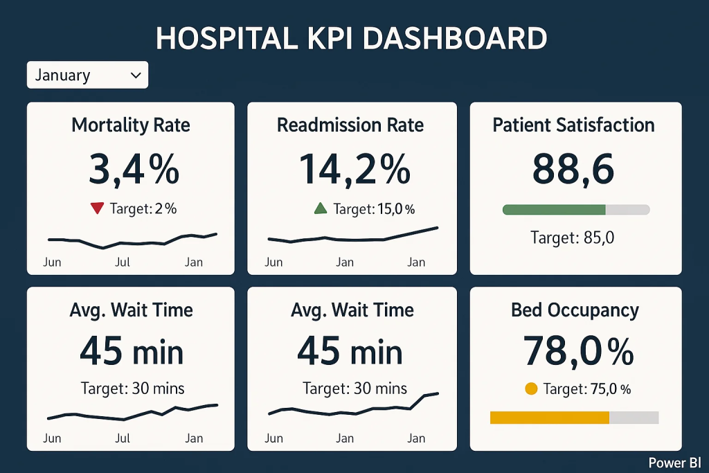
- Quality and Outcomes Dashboard: An executive-level dashboard that tracks core outcome metrics: readmission rate, infection rate, average length of stay, mortality index, and patient satisfaction – all updated monthly. The dashboard uses simple red/green indicators to show performance against targets. The CEO, CMO, and department heads review this dashboard at their monthly quality meeting. For example, the dashboard might show that the readmission rate for heart failure is 18% (red, above the 15% target), while other areas are green. This immediately focuses the discussion on heart failure care.
- Readmission Risk Dashboard: A daily dashboard used by the care coordination team. Each morning, it lists patients who are likely to be high-risk for readmission before they are discharged. The risk score is calculated from an algorithm using patient age, diagnoses, prior admissions, and social factors (Aurora integrated a predictive model into Power BI for this). Today, for instance, the dashboard flags three patients on the cardiac floor with high risk. The care managers can click on each patient to see contributing factors – perhaps one has a history of missed follow-up appointments and lives alone (risking non-compliance). They then swing into action: arranging a follow-up with that patient’s primary care doctor within 7 days, and scheduling a phone call to check in 48 hours after discharge. By institutionalizing this daily practice, Aurora aims to catch issues before the patient goes home. After a few months, they notice their overall heart failure readmission rate trending downward on the executive dashboard, validating the approach.
- Operational Performance Dashboard: A real-time dashboard in the operations command center focusing on ED and inpatient flow. It shows current ED wait time, number of patients in waiting room, beds available on each unit, and even predicts the expected admissions in next 8 hours based on historical patterns (using embedded AI forecasts). On a busy evening, the charge nurse in the ED can glance at the screen and see, for example, “ED wait time: 45 minutes (higher than 30-min target, red alert)” and that only 2 beds remain open in the hospital. With one call, she arranges for an extra nurse to come in for the night shift and coordinates with the inpatient units to expedite a couple of discharges, preventing a bottleneck. Conversely, on a slower day, the dashboard might show plenty of capacity, and the staff can stand down extra surge resources. This dynamic allocation ensures patients aren’t kept waiting unnecessarily and staff aren’t stretched too thin – improving both patient experience and safety.
- Chronic Disease Management Dashboard: Aurora’s ambulatory care team also set up a Power BI dashboard focusing on their diabetic patient population (since diabetes is prevalent in their community). It tracks metrics like the percentage of Aurora’s diabetic patients with recent A1c tests, those with A1c <8 (good control), those who attended a dietician class, etc. Drilling down, the care team can see a list of diabetic patients who are overdue for check-ups or who have had very high blood sugar readings in recent weeks. One identified patient is John, who hasn’t been to clinic in a year and shows rising glucose levels in lab data – the team assigns a nurse to call John, and they discover he had transportation issues. They connect him with a community ride service and get him back in for a visit, adjusting his treatment and potentially avoiding a trip to the ER for uncontrolled diabetes. On a larger scale, by monitoring all their chronically ill patients, Aurora General can demonstrate better management (their registry data shows improvements in A1c control rates and fewer diabetes-related hospitalizations over time). This not only is good patient care but also supports Aurora’s contracts with insurers that reward reduced complications.
Outcomes and Improvements: Fast forward to today – Aurora General Hospital’s leadership is seeing the fruits of these efforts. The readmission rate dropped from 15% to 12% in the last two quarters for their Medicare patients, translating to dozens of patients who stayed healthy at home rather than bouncing back to the hospital. The CMO attributes this to the focused interventions driven by their dashboards. Patient satisfaction (specifically the score for “overall hospital rating”) has improved as well – from the 50th percentile to 75th percentile nationally. In comments, patients mention better communication and feeling more prepared during discharge, which Aurora’s team links to the new care processes guided by data insights. Operationally, the average ED wait time is down from 1 hour to 30 minutes during peak periods after they re-optimized staffing schedules based on the analytics. This was an “early win” they achieved just a month into using the new system – something the COO proudly highlighted to the board. Aurora also achieved some hard-dollar ROI: by reducing unnecessary duplicate tests and shortening length of stay by even 0.2 days on average (through efficiency insights), they saved an estimated $500,000 in costs annually. Just as important, the staff at Aurora General have noticed the culture shifting. Department heads now come to meetings armed with data, and front-line clinicians have greater trust that the hospital is using data to support them in delivering better care, not to penalize them. The fictional Aurora General’s story shows how, with leadership vision and the right tools, a hospital can turn analytics into a strategic asset – one that improves patient outcomes, streamlines operations, and boosts morale all at once.
Implementation Considerations
Launching a healthcare analytics initiative with Power BI (or any platform) requires thoughtful planning beyond just the software. Data integration is one of the first challenges. Hospitals typically have multiple disparate systems – the EHR for clinical data, separate systems for radiology or lab, maybe a scheduling system, HR system, etc. It’s crucial to determine how to pull these together. Options range from building a centralized data warehouse to using Power BI’s direct connectors to each system. In either case, data quality and consistency need attention. For example, if one system lists a provider as “Jane Smith, M.D.” and another as “Smith, Jane,” those need to be reconciled so that analyses aren’t duplicated or fragmented. Aurora General in our example had to work with their EHR vendor to ensure they could extract relevant fields (admission dates, diagnoses, etc.) routinely. Many organizations start with a pilot area – say, integrate EHR and patient satisfaction data first to build initial dashboards – and then expand to other sources once value is shown. Alongside integration, data governance should be established early. This means defining who “owns” the data and its accuracy, setting up roles and permissions (who is allowed to view what in the dashboards), and establishing data definitions. It’s vital that everyone agrees on what each metric means – for instance, how exactly is “readmission” defined or which patients count in “surgery complications” – so that the numbers on the dashboard are trusted. Governance also entails compliance with privacy laws like HIPAA. Power BI has features to restrict access and anonymize data as needed; for example, a dashboard shared with department managers might show aggregated stats by unit but not allow viewing individual patient identities unless the user has clearance. Following the principle of least privilege, Aurora’s team ensured that physicians could see data for their own patients, while executives could see system-wide trends but not drill into PHI details without appropriate cause. Proactive governance and security measures safeguard sensitive data and build confidence that analytics can be done without compromising patient confidentiality.
Another key consideration is staff training and engagement. A fancy dashboard is useless if people don’t use it or understand it. Healthcare workers come from various backgrounds – some may be very tech-savvy, others less so. Thus, part of Aurora’s rollout included training sessions for different user groups: nurses were shown how to interpret the early warning visuals, physicians learned how to filter reports to their panel of patients, and executives got comfortable with the Power BI interface to customize their own view of the metrics. Beyond technical training, it’s also about cultivating a data-driven mindset. Leadership can encourage this by celebrating wins that come from using analytics (e.g., recognizing a team that reduced falls after paying attention to the dashboard) and by making data a regular part of meetings (“Let’s review the dashboard” becomes a standard agenda item). Some hospitals establish a data governance or analytics committee that includes clinical champions – respected doctors or nurses who believe in the project – to promote usage and gather feedback on what data or features are most needed. In our example, Aurora General identified a few enthusiastic clinicians to be “super users” of the system, who then informally coached their peers and advocated for the dashboards, which helped drive adoption.
When it comes to building the dashboards, starting simple is usually best. Focus on a handful of key metrics that align with strategic priorities (like the five use cases we described) rather than overwhelming users with too many charts at once. A clean, uncluttered design with clear labels and maybe some explanatory notes or tooltips goes a long way in making the dashboard self-explanatory. For instance, Aurora’s team used simple color coding (green = on target, red = needs attention) and added a reference line on charts to indicate target benchmarks. They also solicited feedback: the first version of the quality dashboard was tweaked after managers found certain charts hard to read – the team adjusted the layout and added a trend line that was requested. Iterative development is expected; it’s wise to assume that dashboards will evolve as users start interacting with them. Another consideration is performance: as data volume grows, the IT team needs to optimize queries or use aggregation so that the dashboards load quickly. Nothing turns users off more than a slow, unresponsive dashboard, especially in the fast-paced hospital environment. Using summary tables or pre-calculated indicators for commonly viewed metrics can help keep things speedy.
Lastly, consider integration into workflow. Dashboards are most effective when they are a natural part of how work gets done, not an extra chore. That might mean integrating Power BI reports into the EHR interface (some EHRs allow embedding BI content), or setting up automatic daily email summaries of key metrics to certain leaders. Mobile accessibility is another plus – a busy nursing director should be able to check the day’s dashboard on her tablet during rounds. By making access convenient, you increase the likelihood that staff will routinely use the analytics tools rather than falling back to old habits.
In summary, implementing Power BI for healthcare analytics is not just an IT project – it’s an organizational change initiative. Data integration, governance, training, iterative design, and workflow integration are all important ingredients. With these in place, the technology can deliver its promise: empowering teams with timely, accurate insights to drive better care.
Measuring Success and ROI
How does a healthcare organization know if its analytics initiative is truly making a difference? From day one, it’s important to define what success looks like and how it will be measured. Key Performance Indicators should tie back to the very outcomes and efficiencies the project set out to improve. Some core KPIs to monitor when using Power BI for healthcare analytics include:
- 30-day Readmission Rate: Are fewer patients coming back soon after discharge? A decline in readmissions (especially for target conditions like heart failure or pneumonia) is a strong sign of improved transitional care. This directly reflects on patient outcomes and also avoids penalties, contributing to financial ROI.
- Patient Satisfaction Scores: Measured via standardized surveys (e.g., HCAHPS), these scores indicate improvements in the patient experience. For example, as Aurora General’s communication scores improved, it showed the care teams were doing something right – likely guided by insights into where patients felt unmet needs.
- Average Length of Stay (ALOS): This metric, when appropriately adjusted for patient acuity, can show more efficient care delivery. A modest reduction in ALOS without harming outcomes means the hospital is doing a better job managing patient flow and clinical pathways (often a result of identifying bottlenecks in data). Shorter stays free up capacity and reduce costs per case.
- Emergency Department Throughput: Metrics like ED wait time, door-to-doctor time, and left-without-being-seen rates reflect operational improvements. If analytics-driven adjustments (like better staffing models) take effect, you should see ED wait times drop and fewer patients leaving due to long waits, which translates to both better care and revenue retention.
- Hospital-Acquired Infection and Complication Rates: A reduction in infections, falls, or other harm events as shown on quality dashboards is a direct outcome improvement. If the data helped pinpoint a problem area (say, a rise in catheter infections in ICU) and the hospital responded, the success is measurable in these rates decreasing.
- Financial Metrics: While clinical outcomes are paramount, cost and revenue indicators matter for ROI. This could include cost per adjusted discharge, overtime hours, supply costs, and readmission penalty dollars saved. For instance, a drop in overtime hours after implementing resource dashboards, or avoiding a $200k Medicare penalty because readmissions fell, can be quantified as ROI from the analytics initiative.
In addition to these, each organization might track other metrics tied to their specific projects (e.g. percentage of high-risk patients contacted by a care manager within 48 hours of discharge, number of chronic patients enrolled in a wellness program, etc.). The key is that these indicators are visible on the dashboards and can be tracked over time to see trends. Power BI makes it easy to compare periods – like pre-implementation vs post-implementation – to demonstrate impact.
It’s also useful to highlight early wins. Early in the project, look for a quick improvement that can be attributed to using the data differently. For example, Aurora General quickly noticed and fixed the ED staffing issue which cut wait times by 50% in peak hours; that was an early win to celebrate. Another hypothetical early win could be discovering through the dashboard that a certain medication ordering process was causing delays in discharges – the pharmacy and nursing team streamline it, and the average discharge time improves by two hours within a month. These kinds of quick victories create momentum and buy-in. They should be communicated to leadership and staff: “Thanks to our new analytics dashboard, we identified X and solved it, resulting in Y improvement.” It connects the dots between the tool and tangible outcomes.
From an ROI perspective, consider both the quantitative and qualitative returns. Quantitatively, one can calculate the dollar impact: for instance, if readmissions drop and that avoids penalties or yields shared savings bonuses from insurers, those dollars count. If efficiency gains mean the hospital can handle more patients with the same resources (increasing revenue capacity), that’s quantifiable too. We saw an example where one hospital saved significantly by reducing staffing costs 8% through better forecasting – those savings go into the ROI calculus. On the qualitative side, improved patient outcomes (healthier patients) and satisfaction can enhance the hospital’s reputation, which might attract more patients over time (a indirect revenue benefit) and fulfill the organization’s mission. Also, staff satisfaction can improve when they have better tools; clinicians often feel frustration when they don’t have data to inform decisions or have to operate in the dark. By giving them accessible analytics, a hospital can empower its workforce – that’s harder to measure, but some organizations use surveys or feedback to gauge if staff feel more supported by data.
It’s important to continuously measure these KPIs and report on them. Many hospitals create a balanced scorecard or a dashboard-of-dashboards that the executive team reviews regularly. If something isn’t moving in the right direction, it may signal a need to adjust the strategy or dig deeper into the data for root causes. Conversely, positive trends should be acknowledged and linked back to the initiatives that caused them. Over a year, if Aurora General sees that they’ve reduced complications, improved satisfaction, and saved, say, $1 million more than the cost of the analytics program, that’s a clear ROI success story. Even if some benefits are harder to monetize, the improvement in patient outcomes – lives saved or improved – is the ultimate return on investment that validates the effort.
Conclusion
Healthcare is complex, but one thing is increasingly clear: data-driven decision-making is no longer optional – it’s the key to delivering high-quality, efficient, and patient-centered care. The journey of Aurora General Hospital, while fictional, embodies what many real hospitals are striving for: turning massive amounts of healthcare data into meaningful improvements in how patients are treated and outcomes are achieved. Power BI, as a modern analytics tool, is proving to be a valuable starting point for this transformation. It provides a practical, user-friendly way to surface insights that were previously buried in spreadsheets or disparate systems. For healthcare executives, the appeal lies in getting timely answers to pressing questions: Are our patients doing better? Where can we improve? How are our resources being used? Instead of guessing or relying on outdated reports, leaders can have information at their fingertips to guide strategic and operational decisions.
Of course, technology is only part of the equation – the culture of using data and the processes put in place around the tool truly determine success. But with supportive leadership and a clear focus on outcomes, even organizations without a big research department or expensive data scientists can make big strides. Power BI’s relatively low cost and integration capabilities mean even a regional hospital or clinic network can deploy dashboards that used to be the realm of large academic medical centers. It’s about starting with what you have: identify a high-priority problem (maybe readmissions or clinic throughput), gather the data, build a pilot dashboard, and iterate. The experience of seeing one problem solved with data often sparks ideas for the next improvement, creating a virtuous cycle.
In closing, improving patient outcomes is the north star for any healthcare provider. Analytics doesn’t replace the compassion and expertise of clinicians, but it enhances their ability to deliver the right care at the right time. A dashboard will never treat a patient – but it can empower the people who do to see the whole picture and act decisively. Executives at healthcare organizations should feel encouraged that tools like Power BI can translate their abundant data into better decisions, and those decisions into better outcomes. The road to a data-driven, outcome-focused healthcare system is a journey, but each step – each insight gained, each KPI improved – means healthier patients and a stronger organization. Now is the time to take that step. By investing in analytics and fostering a culture that uses it, healthcare leaders can drive meaningful change. Power BI is one powerful means to that end, helping turn daily operations and clinical care into a continuous learning system. The message is clear: harness your data, embrace analytics, and lead your hospital into a future where every decision is informed and every patient can benefit from the collective insights of your organization. The result will be not just numbers on a dashboard moving in the right direction, but real lives improved and saved – the ultimate measure of success in healthcare.
Other articles


Case studies
Tikkurila filled the gap in the skilled workforce by engaging Multishoring’s consultants in an Integration Platform Migration project.
About the Client and beginning of cooperation
Let's talk about your IT needs

Let me be your single point of contact and lead you through the cooperation process.


Signed, sealed, delivered!
Await our messenger pigeon with possible dates for the meet-up.
